This week I began really honing in on ways that I could use the shapes/patterns I had created previously to bring my branding to life. Last week I found that re-creating them digitally simply wasn’t enough, and in fact, by doing so it reduced the impact that they had before. To counteract this I knew if I were to have them in a digital space, they needed to be brought to life somehow, whether that be through 3D design or animation. Or even both (if my skillset would allow me!).
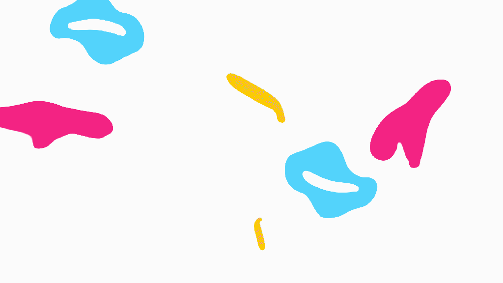
Although I only know the very basics of After Effects, I had enough knowledge to make the patterns move and appear somewhat lifelike. It may not be the most polished of GIFs, but it was certainly a step in the right direction. In fact, I sent this GIF to Harriet Beesly and got some really interesting feedback – she mentioned that the shapes were beginning to look like microorganisms, and brought up the concept that the branding message could be that ‘joy was infectious’. However, given the current climate, we both agreed it wasn’t an angle I could take right now (although it was a really good suggestion for another time!). We also spoke about how I could develop the brand further in general and she gave me some really great references.
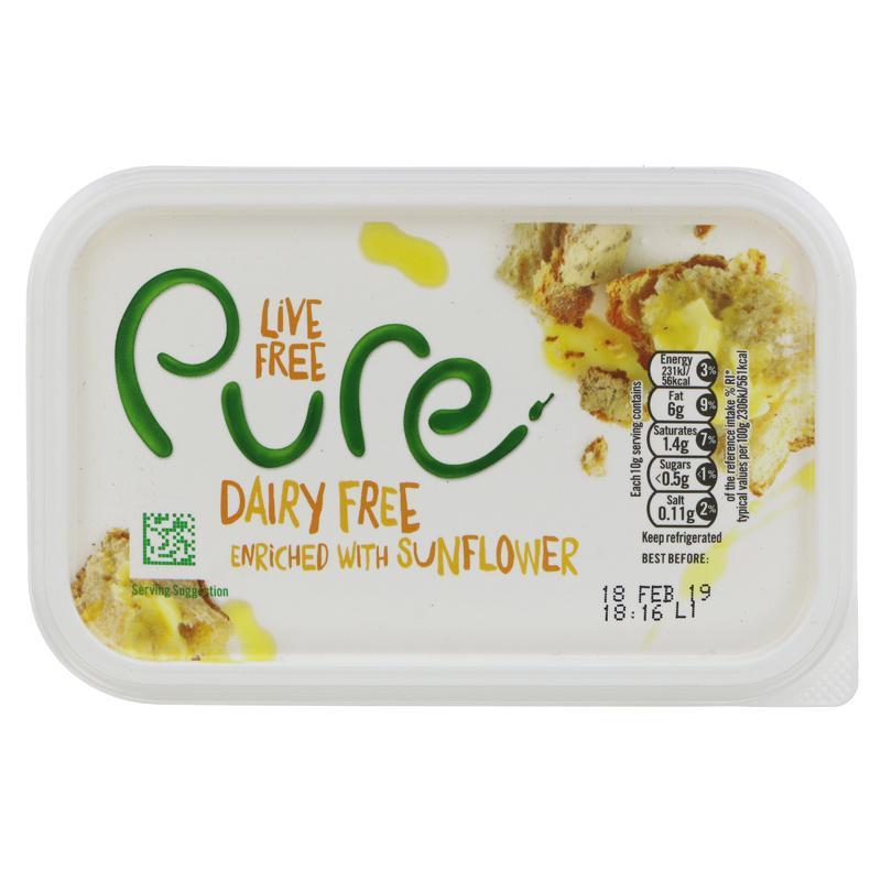
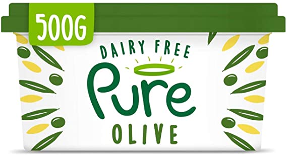
We spoke about the branding Harriet had created for Pure a couple of years back – she had a similar approach to my own project by choosing to create the logo type using balsamic vinegar to keep it looking organic and lifelike. However, in more recent years the brand has flattened the logo, changing the type face in the process. Although I don’t dislike the new take on it, I much prefer Harriet’s take on the logo. It gave the brand a unique aesthetic and a story to tell, whereas the new flattened version look like a lot of brands you’ll see now, it blends into the crowd. On the other hand, I understand that having a flattened logo is much easier to ‘stamp’ onto letter heads, staff uniforms ect – but why not have both? This was a brilliant example from Harriet and I’m really glad she’s brought it to my attention. It’s certainly secured the choice to use multi-media within my branding.
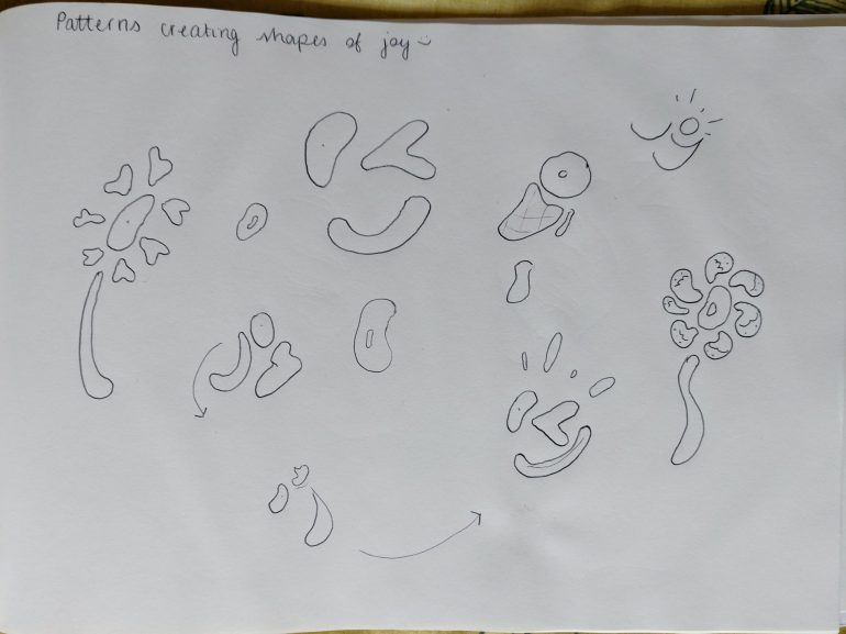
Another idea I had was to began trying to form new objects, shapes or phrases using a combination of the shapes I had created. As you can see from the sketch above, I also began forming potential stages for animations (the middle, follow the arrows to see the patterns that make the word ‘joy’ turn into a winky face). Potentially these could open up some more opportunities to create small indents? I visualised an animation showing the shapes creating the word ‘joy’ then performing a routine of different arrangements to form other objects, symbols or words that would reflect on what the project was about. Joyful things!

After recreating the ice-cream concept from my sketches in Illustrator, I could already see how lifeless it was looking, so decided to add in some emboss effects from Photoshop to help give it some extra depth. I do think this helped, however I still found it quite frustrating that I was unable to created a fully rendered 3D design. To highlight the 3D-ness of the ‘ice-cream’, I added in some flat dots around it – I actually really liked the combination of (seemingly) multimedia for the branding, and thought if done rightly, it would be a great way of demonstrating the overlap of digital and physical activities within the project really well.
I actually ended up keeping the animation really simple. By adding in subtle movements to the separate shapes that made up the ice-cream, I think I managed to capture the idea of 3 different elements coming together to form one great (and joyful) thing. I do think this could be extended into an animation that shifts and changes to make other objects, but due to a lack of both time and After Effects skill, it wasn’t possible right now. After showing Stuart this short animation, he mentioned that he found the colour choices to be quite confusing, which I totally understand. Potentially it would of worked better if I switched the colours round so they replicated ice-cream a little better (yellow for the cone, pink for the ice-cream), however, the branding colours were quite restricting in that sense. So the question is, do I continue making things look absolutely bizarre with odd matching colours, or do I broaden the colours within the brand?
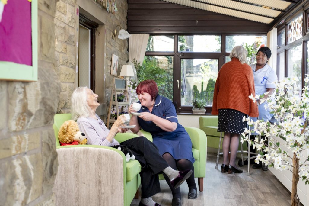
Prior to the live session I had been thinking of different ways that people (and myself!) could distribute the postcards made safely, and came across Skipton Nursing Home. During the pandemic, residents within nursing homes have arguably been the most isolated of all, as the majority of them are seen as high risk, they’ve had no access to the outside world or their loved ones during the entirety of lockdown. After speaking with one of the key workers from the nursing home over the phone, we discussed a way which I could collect and donate postcards to be safely distributed to the residents of the home.

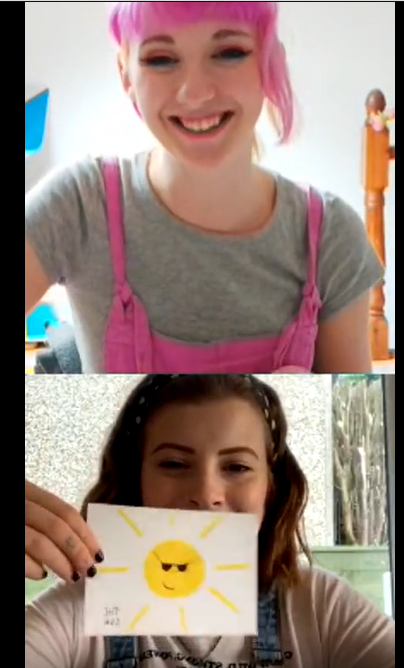
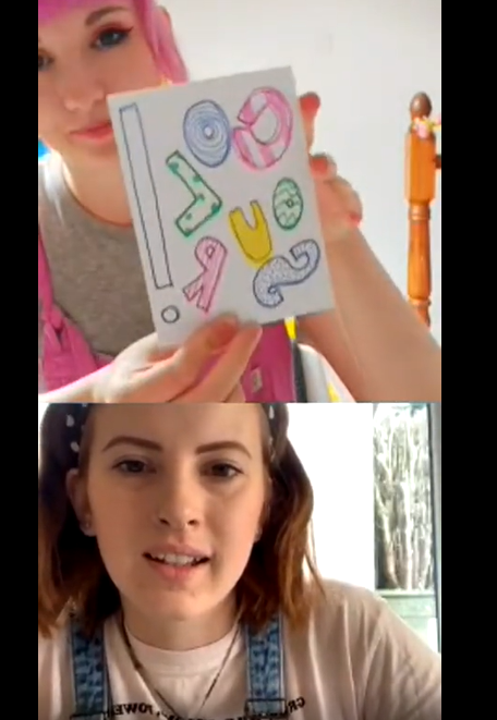
This workshop was a little different to the other ones we’ve hosted in the sense that it wasn’t necessarily guided which resulted in it being more of a live drawing session between myself and Beth. It made for some super calming content and resulted in a series of postcard being created by myself, Beth and 6 others and around 20 individual postcards being donated to the Skipton Nursing Home – fantastic!
This week Debbie sent off the HAZ application (including the Joy in Numbers proposal) in hopes to receive the Pilot Activity grant, fingers crossed!
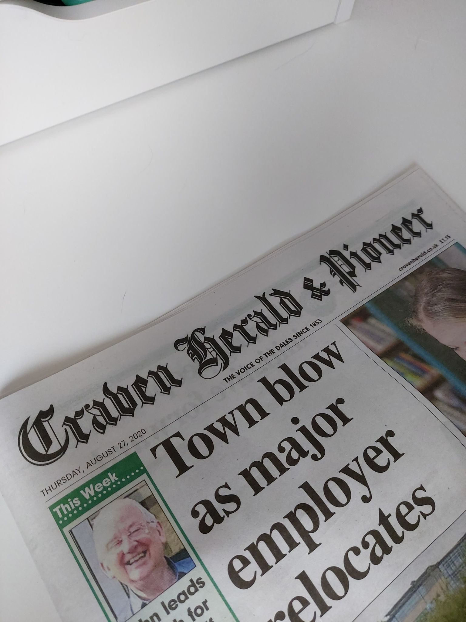
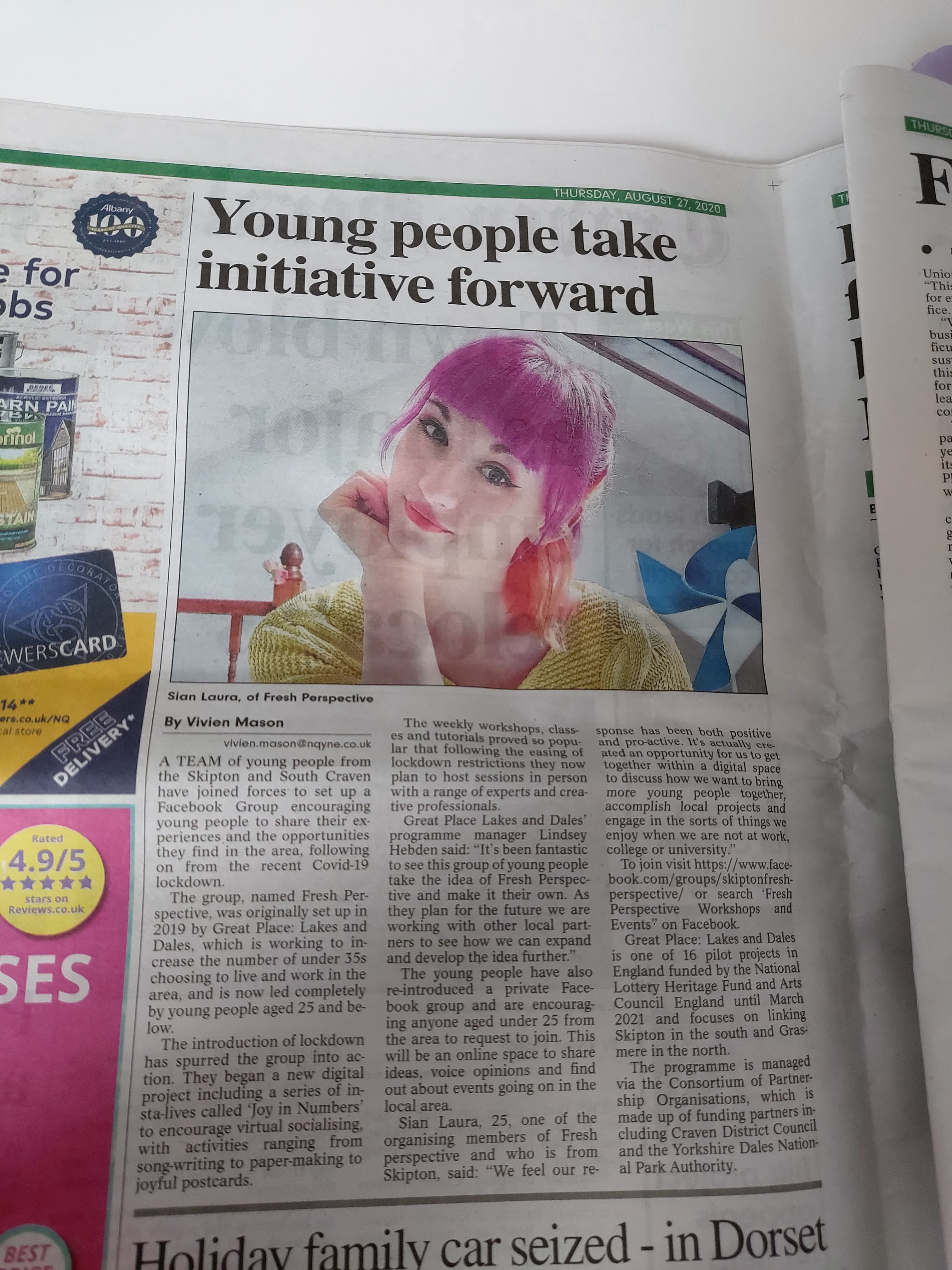
Great Place: Lakes & Dales also got in touch with me this week about a press release they’re wanting to put together for the Craven Herald, a local newspaper. The press release would highlight the projects success and how it can continue to help others during the pandemic. Acting as part of Fresh Perspective, I provided a quote, general information on the project and helped guide the press release to make sure it providing the right information on how other people could get involved or access the live sessions. As it was Great Place: Lakes & Dales who approached us, it was completely free of charge too. They say all press is good press, but I think it’s made even better when it’s free!