The Idea


Research & References
https://www.hypnosisdownloads.com/blog/environment-to-influence-people
https://www.quora.com/How-does-our-subconscious-affect-our-everyday-lives
http://www.tonyfahkry.com/subconscious-mind-and-its-impact-on-our-behaviour/
Re-creation
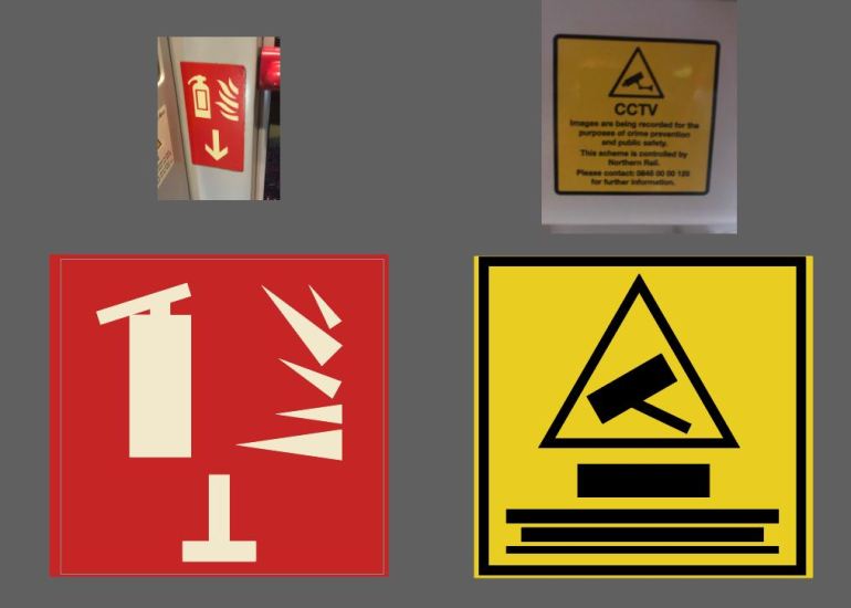
Although we have public notices, signs and posters everywhere we look, I thought it would be best to begin with what I could find just on public transport to begin with. By focusing on one particular area it gives me the chance to gather much more precise data when I got to the stage of creating a survey for the public to fill out.


I collected a variety of signs and posters from public transport, during this process I was actually amazed how many times each sign was duplicated within each carriage. I understand the reasoning as they want to ensure anyone can see them, but it’s 4 of the same sign/poster a little excessive?
I wanted to use these designs in a public survey to generate some emotion feedback – however as these are signs that are so frequently seen I don’t feel like they would have much of an impact if I was to just show a collection of these as they are. To avoid this, I would break the survey down into two primary sources. One was to be a video displaying a series of designs that re-create the visual aspects of the signs and posters. The other video was going to portray the language used within each one via audio.
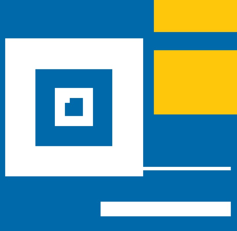
So instead, I decided to break down the signs. I would create a series of abstract designs based on the above signs using the same colours, shapes and layouts from each one. Through this process the designs would become unlegible and I believe this would allow me to gather a unbiased response from the public.
I began by simply blocking out any text and simplifying each shape – to me this was still very obvious what each of the designs were replicating. So I decided to stretch it even further by playing with the scale of each element.


I feel that the end result of this definitely took it away from the originals enough for people not to be able to make a direct link to them unless provoked. To display them to the public I decided that a short animation would be best, this way I could have a preset timer on when the slide would move across to the next design to avoid people lingering on one for too long.

For the audio video I kept the visuals as simple as possible, I was originally going to have the background as just plain colour that changed with each message, however I felt that that was just too plain so added in an explanation mark and a question mark to symbolise the use of language.

During the editing of this video, I ran into another ‘happy accident’ where I overlapped some of the audio clips which resulted in a confusing, busy message. Although I felt this was an accurate representation of how I felt, I didn’t want this to create bias in the survey. However I did use the overlapping of the same words to create an emphasis on the key words within the phrases.
Surveying
I kept the survey as simple as I possible could to allow it to be a quick, easy process for those taking part.
Looking back on the phrasing used, perhaps I shouldn’t of pushed or limited the participants to choose 3 words. I feel that this may of forced people to think about their response more than I initially wanted. In future I could re-phrase the questions as “please choose up to 3 words” or “please describe how this made you feel”.
However, that aside I’m still pretty happy with the success of my first survey, I generated some interesting responses and it’s something I will certainly be using as part of my design process in the future.
As all the feedback provided was emotional based, I analysed the results by creating 3 types of response; Negative, Neutral & Positive.
Results (based off 16 participants):
Visual Response
Negative – 62.5%
Neutral – 31.25%
Positive – 6.25%
Audio Response
Negative – 56.25%
Neutral – 18.75%
Positive – 25%
I would like to say that I’m shocked at how negative the results came back, but I’m not. In a strange way I was quite glad that this has proved that it’s a collective response to our current methods of getting important information across as it now gives a perspective on how I can resolve this.
Outcome
I wanted to create a chance for the data I had found through the survey to really connect with the audience, so I knew from the get go that I would be directly placing the words provided to me by the survey participants into the final design, however I wasn’t sure on how. I did consider using just text alone, creating the larger percentages out of the words provided however I didn’t want this just to be another statistic for people to read.
So instead I created a pie chart. I’ve always found pie charts to be the most ‘welcoming’ of graphs, they’re easy to read and the round shape makes it quite appealing. In this situation it especially worked to my advance as I could manipulate the charts to represent a face.
Using colour and facial expression alone I have removed the need for a guide on the graph, making it even more clear and easy to understand. Although I’m not 100% on the final outcome, I’m happy with the overall message and tone the charts provide.


