Bradley’s Voice
Following on from last weeks typography finds within Bradley Village, I decided to re-visit some of the sites as well as attempt to find more similar type faces within the surrounding areas.
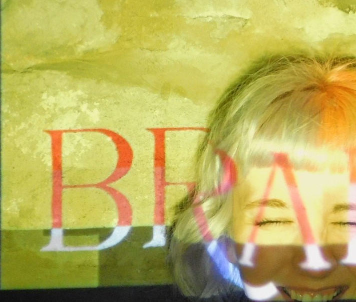
I revisited the old gate with it’s loud, yet ignored sign to try and work out the randomness of the typeface that had been used.


Each letter seemed to have different cut off points, with no real order or reason. After closer inspection I found that the ‘Health Hazard’ that was above the ‘No Dogs Allowed’ sign was the same typeface, but each letter was straight edge. This led me to believe that whoever was put in charge of adding the additional lettering either wanted to add a flare of their own to the lettering or they simply did a rough job.
On my way round I also came across another engraved on the entrance to Lidget Croft. It’s something I had never really stopped to look at properly and once I shed some attention onto it I found myself so excited with what I found – unlike the usual, straight Romans Serif style signage around Bradley, this one had a bit of a kick to it. It had begun exploring ways to quite literal, bend the rules. It’s curve serifs gave the text a real sense of fun and character.


When comparing this to the other two main engraved signs of Bradley, I began to notice the movement between each one.
Although I’m not entirely sure on the exact year the Bradley entrance sign was put up, I’m certain that this was the most original of the 3. In comparison two the other two this is the most traditional looking of the typefaces.


Lidget Croft’s sign from 2002 went in the complete opposite directly, trying to bend out whatever it possibly could get away with. Then lastly there’s the Bradley Mill sign that was created in 2005. This sign seems to be doing it’s best to link the previous two up by tying a modern style in with the basis of the traditional typeface. However, I feel that during this transformation the curves that gave Lidget Crofts sign such character has been overridden.
The Idea
I wanted to create a typeface that combined the primary elements of these three signs together.
Keeping the original entrance sign as my base, I began pulling out my favourite features from the other two to combine together. I knew that I wanted to re-create this sense of play that was demonstrated in the Lidget Croft sign, so felt this was best done by bringing the curves from this typeface into my design. The only thing that really caught my eye from the Bradley Mill sign was the ‘A’, by removing the cross section is leaves the viewer in a limbo of uncertainty as they are left questioning whether it generates a very modern presence of if it is infarct resembling text from the past. So that’s what I kept.
After coming across a small series of hand drawn posters from Bradley’s Primary School last week I knew that I wanted to demonstrate this part of Bradley’s community by adding in an element of human to the typeface. The best way of creating this I felt was by making the lettering look somewhat hand drawn.
After I had decided on the base of my idea, I began drawing out ideas on how to make it happen.
The Process


The Outcome
Homes Charm


