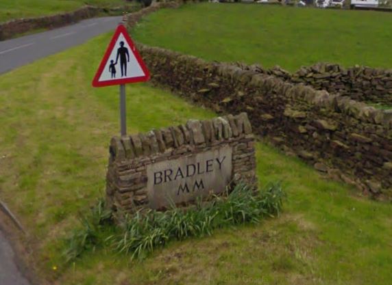
Bradley Village’s Typeface
The first thing that come to mind when thinking of Bradley Village is the ever changing colours of the leaves and the crumbling stones that so loyally hold up the farm walls and our neighbours homes. If I was challenged to stretch my mind further, I can begin to think of the narrow ginnels and sidewalks I pass each day and the happiness spread across a dogs face and its proud owner as they pass by me on their routine morning walk.
Never would I begin to associate my village with typography. However once I began looking out for it, I discovered that there was in fact an abundance of language and culture hidden within each sign, notice and poster that we choose to display around our village. There was so much said not by the context within each one, but rather the process of how each message was delivered.
On the contrary, I also found that there was quite a lot to be said to those that were left without any text on whatsoever, for example the book share outside of the village town hall.


There’s no text simply because there’s no need. You know what it is immediately, so adding words to the equation would be a waste.
Whilst out walking to see what I could find in Bradley, I found quite a variety of different signage and type, most of which was either hand drawn or roughly put together using Microsoft Word and simply put out to delivery information over anything else.


")


This week has really allowed me to look at type through a completely different lens, the phrase from one of the videos shown in this weeks lecture has really stuck with me…

“Words have meaning and type has spirit and the combination is spectacular”
-Paula Scher
As typography hasn’t been something that I’ve shown much attention to previously, I took this as an opportunity to explore the possibilities and perspectives of typographers and discovered so much more than I had intended.
During Mia Cinelli’s TED talk, she tells use that she based her typeface on an old piece of handwriting she found from an abandoned town – she then goes on to explain how she has managed to use the creation of this new typeface as a method of continuing an element of someone’s past and place into the present and hopefully the future.
By using someones handwriting, not only are you creating a new typeface, but you’re also extending someones voice and message. By singling out that one persons handwriting, she has managed to carry on an essence of the town on beyond it’s years.
Litter Bug
Bottom corner of Matthew Lane


This letterform is hand drawn by a child from the village school. You can see faint lines from where they’ve used a pencil to decide where they’d like the display their message and perhaps practices the bubble writing a few times before finalising the words with a felt tip pen. It’s been made with care. The message in the context is straight forward and clear, yet the power truly lies within the fact that it’s been delivered in such an endearing, human way. Despite it’s forward use of language, it’s design allows it to comes across as a gentle request or reminder.
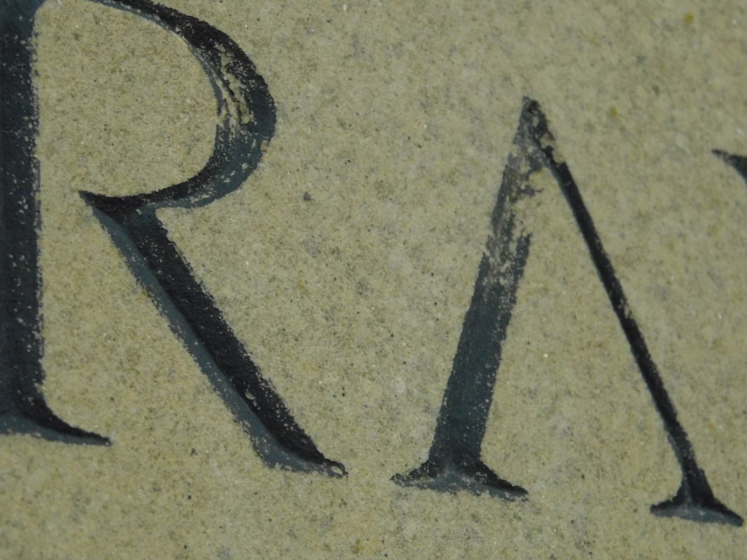
Bradley Mill
Ings Lane, Bradley


Bradley Mill was originally constructed in the 1860’s and was recently renovated into 28 modern new homes in 2005. Although this was still quite a drastic change to happen within the village, you can still see the care that was put into ensuring the mill fit it with the Bradley aesthetics, for example, by using a Roman serif typeface were able to add a respectful, traditional standard just like the text that is used on Bradley’s welcome sign. They’ve continued a ‘brand’. It’s also for this reason, that I believe they decided to have the sign as an engraving rather than a stand alone sign. To look like it belongs.
Community Notice Board
Within Bradley Village Shop


What I found the most interesting about the communities notice board, is that we actually already have an ‘official’ one, at the bottom of the park. However when I went to find what was there I noticed that it was so bare in comparison, after some research I found out that the reason for this was due to people having to gain permission through the council first before being able to have anything displayed there. So the people have taken it upon themselves and set up their own community board. This just goes to show that no matter what boundaries are put in their way, this villages community will find a way to communicate, one way or another.
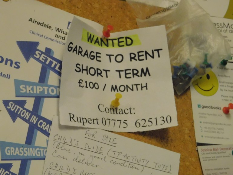
This post in particular stood out to me because of it’s simplicity. Whoever has created this wanted ad clearly does not care for appearances, this is transparent in their font choices and even though Comic Sans usually screams out quite a childlike nature, due to the straight forward context and lack of colour it actually comes across rather direct and to the point. Rupert, whom I’ve assumed to be quite tall due to the high placement on the notice board, has shown that he has trust within the community and it’s system by sharing his personal details and adding to the method of the community board.
Dog Poo Fairy Sticker
Bradley Village Shop Door


The best thing about this sticker is that it you read it as if it coming straight from one of the neighbours mouths. It does such a brilliant job of capturing the communities attention by mirroring their language and sense of humour.
The typeface compliments the comedic perspective by keeping it light and curly – the outer glow around the lettering helps blend the text in with the rest of the imagery to prevent it looking standoffish and alone. However, even though all the text within the main context is all the same size and weight, by capitalising ‘Dog Poo’ it’s ensuring the main focus is still kept to the original point.
‘No Dogs Allowed’ Sign
Entrance to Bradley Park


This sign has been up for as long as I can remember, and although the people within Bradley are usually reasonably obedient, I know that this sign is ignored quite often despite it’s loud, clear instructions. You can see the marks where it’s been kicked open by the villagers – it clearly hasn’t been respected.
Whilst trying to think of reasons for this, I came to the conclusion that it is because it is an outsider. Whoever has designed this sign has given no thought to how it would fit in within Bradleys aesthetic and community. Putting the text in a red, all caps, bold typeface makes it come across loud and abrasive rather than informative and respectable.
