
Research

As one of our resource for this week we were able to listen in on interview conducted by Susanna on Patrick Thomas’s recent project, “Breaking News”. I loved how this project gave people the opportunity to write anything without rules or guidelines. By having it all anonymous and randomly generated he’s potentially taken away the ‘social cap’ where people may of been afraid to write something that could be traced back to them.


Global Reports – Case Study


This week I’ve been looking into the differences between international news channels, to see what they hold as the upmost importance in comparison to other countries. My first instinct was to compare the news between two countries at different stages of development, for example, the UK and India. However I thought it may actually prove more interesting to research in three reasonably level countries. So I’ve chosen The UK, USA & Australia. As these three countries are so similar in many ways, it has allowed me to distinguish deliberate differences that have an overall impact on the text and meaning.
I began by looking into a news channel that actually covers all three countries, Sky News. Although each channel is technically under the same media company, they each either have their own page or site, and the differences between them all are pretty extreme.


Going off their home pages alone, it already gives a huge indication to what type of news is deemed important within each culture. Australian news seems to be a little more global, covering a range of topics from liberal points to environmental. The UK is a little more close ranged, as it seems to primarily cover national news. The USA news however is completely different, it’s far more lax and prioritises celebrity and social news along side it’s political views.
Here are two screen shots I got of today’s ‘most read’ columns on both Sky News websites (UK & USA share the same site so theirs unfortunately are merged into the one on the left).


Although you could argue that all three cover just about everything the public need to know, if they search for it, it goes to show through their ‘most read’ columns just how much of an impact this one choice makes. The public will primarily digest the information that is handed to them easily, so by choosing what you want your consumers to see on your homepage, you effectively have the power to manipulate your targets knowledge on specific matters. As interesting as this is – it’s extremely worrying to see that the USA would rather people know that Eddie Murphy is going to have a 10th child, over the declining health of the planet we live on.


Sir David Attenborough recently spoke at the UN climate change summit to raise aid raise awareness on the importance of global warning, he spoke out on why and how we need to act now in order to prevent harming our planet and ourselves anymore than we already have.
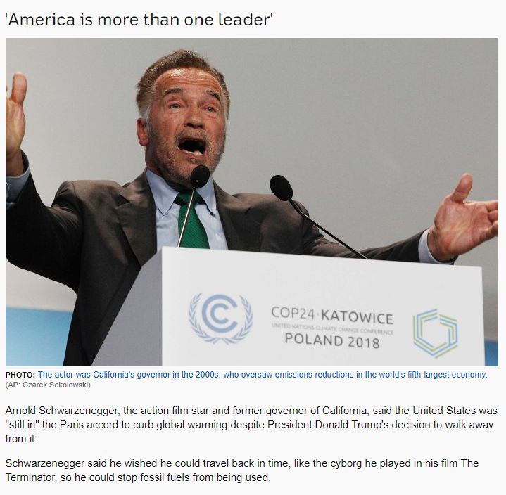
Australia – ABC
Surprisingly, Australia’s New channel, ABC, shows the most contrast within it’s headline. As both the UK (BBC) and the USA (CNN) channels focus on David Attenborough and what he has to say on the subject of climate change. However ABC’s headline ties both David Attenborough and Arnold Schwarzenegger into their headline and implement that their there to lend ‘star power’ to the UN’s climate talk. Personally, I think this almost degrades the point they’re trying to make. By using the phrase ‘star power’ it almost comes across like their simply their to get attention in a charitable sense which completely takes away any trust you actually have in what it is they’re saying.
In fact, the whole report seems to focus on the power of movement through strong words and social stance rather than the actual facts and figures of global warming – which isn’t too helpful on a topic where the people need to be educated in order to participate to change. Unfortunately the use of bold language seemed to of get the better of them as they decided it was the right time to ,seemingly randomly, insert some humour. It wasn’t the correct time or place and it certainly reduced a lot of power from Arnold’s’ previous statements.
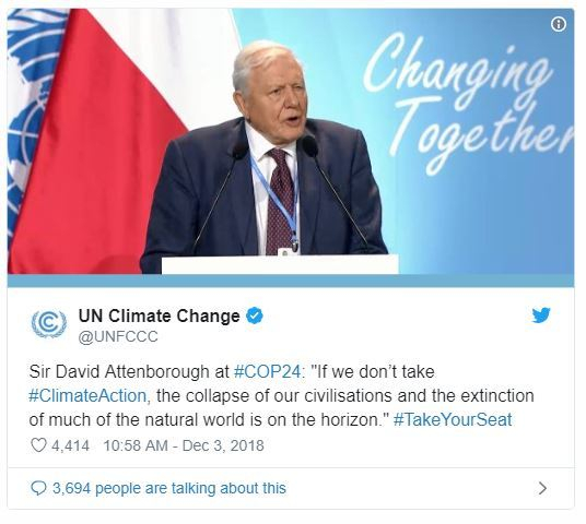
“The 92-year-old famed British naturalist and BBC presenter blamed humans for the, “man-made disaster of global scale, our greatest threat in thousands of years”.”
“UN secretary-general Antonio Guterres issued a dramatic appeal to world leaders to take the threat of global warming seriously and to act boldly to avert a catastrophic rise in temperatures before the end of the century.”
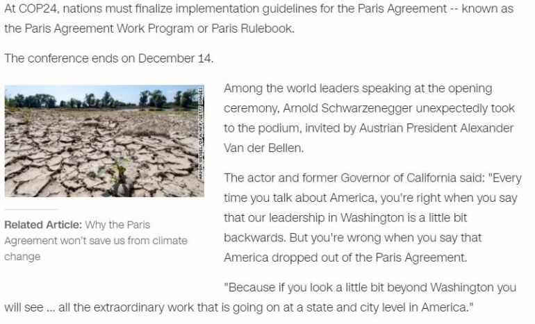
If you’d like to read their full report, you can find it here.
USA – CNN
The USA report almost went in the complete opposite direction, they put a lot of emphasis on what David Attenborough had to say, however this time it was displayed as more of a plead than a discussion.
Asked about the United States, which President Trump has said will leave the Paris Agreement, Attenborough pleaded for the US to remain committed to fighting climate change.
“Please join the rest of the world,” he implored. “The entire rest of the world is united in trying to take action on this. The United States is a very, very powerful voice. Please, please, join us.”
UK – BBC
“Sir David Attenborough: Climate change ‘our greatest threat'” – now that’s more like it.
The UK’s approach was very direct, and straight to the point. The report left no room for opinion, it simply stated what had been said, then went straight into facts and figures on why the meeting had taken place, what information you can take away from it and how you can help. In my opinion this report is the only one out of the 3 that provokes actions – which is arguably the most valuable take away from this.
It has taken a much more education route, allowing those who may be naive on the matter to participate, learn and assist. Also, by assuming and answering questions the public may have on the situation it almost eliminates the opportunity for somebody to lose interest due to unknown factors. I think it’s fair to say that the more we know on something, the more engaged we become with it.
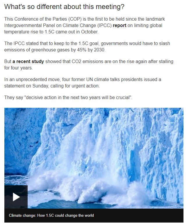
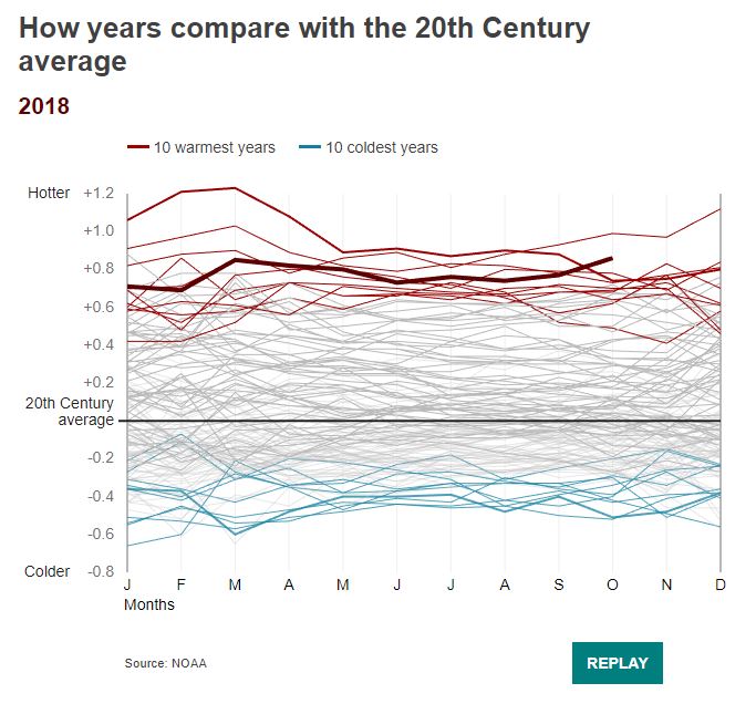
On the other hand, it is possible that there may be an overwhelming amount of information for someone new to tackle – it has been broken down into manageable bite-sized chunks that allow for information to be easily digested however the layout could of potentially of been switched around so that the confusing content, such as this pretty complex looking graph, doesn’t have the chance to scare people away.
If you’d like to read this article in full you can find it here.
Conclusion
The main takeaway from conducting this case study has been the realisation of how much of an impact a slight change of words or focus points can have on a story, and thus the publics mindset or opinions.
Although these three news channel are each reporting the same story, by the use of layout, language and context they’ve created three separate meanings and intentions. The UK (BBC) report was there to educate, inform and provoke action. They were there to tell you the story, why it had happened and then provided the reader with bite sized chunks of information to educate people on the matter at hand, allowing for action to then be taken place should they wish to. I think it’s fair to say that the more we know about something, the more engaged we become with it, so by assuming and answering questions that the public may have on the matter, they’ve almost eliminated the opportunity for somebody to lose interest due to unknown factors.
The USA report (CNN) was there to give the impression of control over a situation. The video report was delivered through one closed question to David Attenborough rather than showing a clip of his actual speech unlike the other two reports and the written context provided on what he had said at the summit was primarily that of which regarded USA directly, by doing this they’ve narrowed down the resources that back the idea for anyone to potentially form an opinion of their own. Their headline was extremely similar to the UK’s, however by skipping out on the ‘Sir’ of David titles they’ve straight away taken away any impression of respect they had given on what he had to say on the matter. Interestingly – the USA were also the only ones to include social media (Twitter) as one of their references, this made me consider whether this was due to cultural differences, did they need to use something their audience find familiar to get them to engage? Or did they simply see this entire subject matter as passive as an everyday social media post?
The Australian report (ABC) seemed to also strive for change or action to be taken place, however as their approach was completely power driven without the educational factors to back it up, it just came across brash and overall pointless. They spoke of Sir David Attenborough and Arnold Schwarzenegger’s as if they were merely there for ‘star power’ in the headline, giving the reader the impression they’re only there to drag attention to a vulnerable matter, belittling what it is they had to say on the matter – focusing on the humorous points of Arnolds speech certainly assisted with this too.
By choosing to focus on three countries within close proximity of development stages, both socially and culturally it’s given me the opportunity to more accurately consider which changes have been made deliberately to conclude to an overall point of view and meaning which directly impact their consumers. And quite honestly, it’s terrifying.
Visual Representation
In this weeks webinar David Shrigley was brought up as a reference. I’d seen some of his work in passing previously but never really stopped to look into them. Just from simply having a browse through some of his drawings and paintings, it gave me a real nostalgic feeling of just drawing for the sake of drawing. Not drawing to perfect, create or demonstrate. Just enjoying what you’re making.
, 2014")


It inspired me to create this weeks visual representation through my original methods of doodling, pen to paper. I’ve always loved the seriousness you can build up simply by going over a line repetitively using a black ink pen, and it certainly fit in with this weeks topic. So why not?
When I tried to put this case study into a visual interpretation only one thing really came to mind – noise. Cluttered words, overused and outspoken. Loud. Dishonest & disturbingly truthful. All these news reports had the same input but created completely different outputs. In attempt to try and be as literal as possible, I thought I could display this by using a series of child like beings, just screaming over one another.
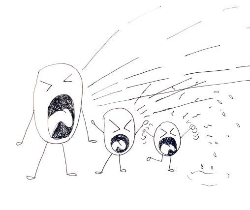
But this didn’t really work as the noise wouldn’t coming from the same source. So instead, I drew out a speakerphone and added a voice changer switch. It felt so simple and that’s what I liked about it. I drew it out using a fine line black ink pen.
Although this seemed to get my original point across, I felt like it needed tying into the case study a little more. I decided on ‘anyone’ as the input and ‘everyone’ as the output – because literally anyone can become in control of creating media for the world to see in todays world, whether that be on an official news channel or on a private blog. You can post your opinions out globally for the world to absorb.


although I made a few attempts before creating the final piece, I’m glad that I decided to keep a first hand sketch as my final piece. I like how the additional lines and mistakes add up for an overall ‘noisy’ effect.

It was honestly quite freeing using a ‘doodle’ as a final piece, I really enjoyed going back to my roots and just drawing out raw ideas into visual interpretations. It’s something I think I’ll be re-visiting again in the near future.
Documented Content
