Research
During this weeks lecture, Kristoffer mentioned Beatrice Warde‘s Crystal Goblet Theory. She proposes that graphic design should be clear & transparent.
She compares typography to goblets and notes that those who know something about wine, or profess to, will prefer a clear crystal goblet. The various elements of the drink can be observed, colour, fragrance, without undue concern for the vessel that carries it. Those who prefer a gold, gilded, ornate goblet put more importance in outward appearance than in the wine itself. The typographic form that a text takes can illuminate what it is meant to carry and portray, the printed word, or it can distract or detract from or even contradict it.
Simply put, graphic design acts as a container for the content you’re trying to communicate, so by making it clearer, you’re allowing your audience to understand it’s contents further. They’ll be able to observe it first, allowing for them to gain enough trust to interact or digest it’s content.
I really enjoyed how she’s explained a graphic design problem through a graphic design medium – by that I mean she’s taken a problem and conveyed a solution & explanation through visualisation.
After learning about linotype machines, I just had to see one in motion. I managed to find this interesting video from youtube that breaks down how it works.
The Idea
As I was aware that typography isn’t something I find easy to connect to, in order for me to really get to grips with this weeks workshop challenge I wanted to reform or make an adaption of our existing English language.
After researching into typography and watching through this weeks lecture, I started to look at text as a collection of shapes rather than them being readable words. I saw that they were easily manipulated by adding or subtracting a few lines. Grammar, for example. By simply adding a few dots… you force the reader to manipulate how they are to read those shapes – in this case, you were forced to briefly pause mid sentence.
I began observing letters singularly, noticing that most of them could easily made made into a completely different letter by taking away a small part of them.

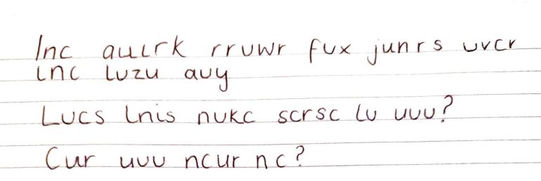
I wrote out the alphabet and began rubbing out parts of them to form them into other letters. For example, a lower case ‘a’ became a ‘u’ by removing the upper arch. Using my new version of the alphabet as a guide, I began writing out a few sentences – and it’s safe to say that it totally changed the deliverance of the messages. As you have access to the above guidelines, I’ll leave these as they are for you to decode if you so wish.
Now to choose a piece of text that I wanted to focus. As I’ve always been a fan of short poems – I decided to focus on those. Narrowing down my options greatly. I’ve always loved poems that focus everyday struggles or actions of the majority. Like how the repercussions of one small act, whether that be out of hate or kindness, can have such a large impact to an individuals life.
For want of a nail the shoe was lost.
For want of a shoe the horse was lost.
For want of a horse the rider was lost.
For want of a rider the battle was lost.
For want of a battle the kingdom was lost.
And all for the want of a horseshoe nail.
Unknown Author
I decided to dive into the poems of the Bronte sisters, as they lived so close to me, it only seemed natural. Although their cultures would of been completely different back then, knowing that they were primarily based in West Yorkshire for most of their lives led me to believe that this would give me more of a chance to understand their poems by being grounded within the same environments they once were.
She dried her tears and they did smile
To see her cheeks’ returning glow
How little dreaming all the while
That full heart throbbed to overflow
With that sweet look and lively tone
And bright eye shining all the day
They could not guess at midnight lone
How she would weep the time away
Emily Bronte
This poem stood out to me mainly because it’s main focus is the invisible day-to-day struggles an individual may be camouflaging behind a happy persona. It spoke to me immediately and it seems the perfect opportunity for me to put my new take on the English language to use.
Creative Process
To begin with, I wrote out the few few lines then repeated that process using the new language/code I had previously created.

Seeing as writing it like this made it almost impossible for the reader to understand it’s context, I decided to perhaps have the words becoming more and more complete the further down it got. This not only gives the reader a chance to understand what it going on, but it also gives them perspective on how little a change was necessary to completely disregard the letters previous intentions.
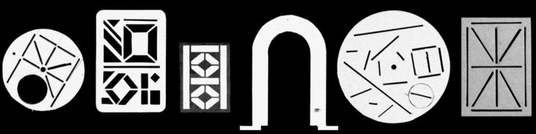
After speaking to Kristoffer about my ideas for this weeks challenge, he pointed me in the direction of Karl Nawrot who sculpts, makes models, including stencils, & engineers machines to create his experimental type. I focused on the stencils and how you can use them to create a base guideline or even as a tool to create interesting pieces of design, whether that be an illustrative or a typographic piece.
As I so far had only decided on the style of language I was going to use and the context of what it was going to say – I had no idea on what layout I was going to use. So I began trialling a few ideas, giving myself a few basic lines and shapes to base my text around as if they were my stencils.
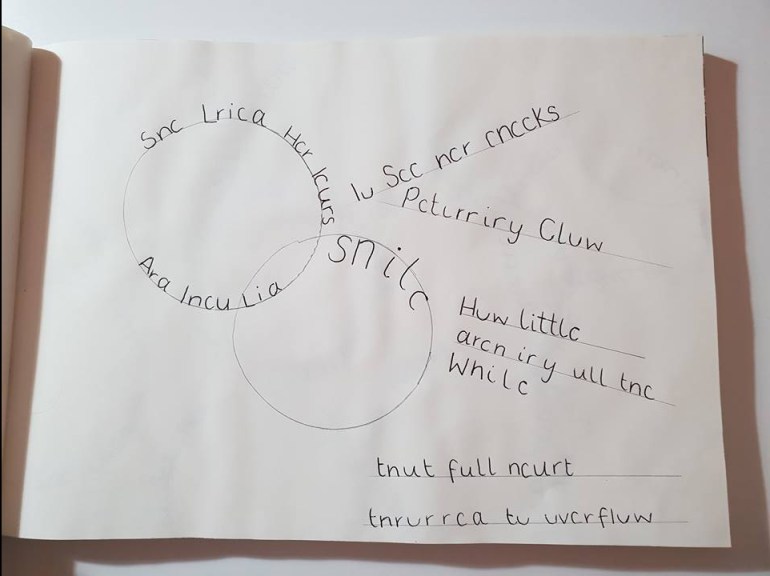
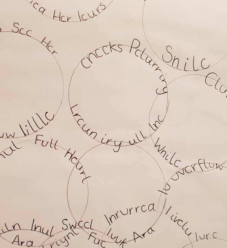
I began by randomly placing a series of circles and straight lines. As this was the first draft I didn’t actually put any thought into the placement of each shape, however after I had began to add in my words, I quite liked the outcome. However I couldn’t fit in the entire poem using this method, and I felt that I couldn’t really add anything more to it without losing what I had created already. But I didn’t like how the words sat on the circles. So I tried filling an entire page of circles to see what the outcome would look like…
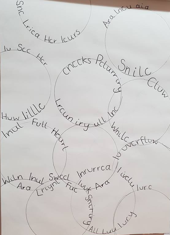
As much as I liked the movement of the words around the circles, I felt that it was overcrowded and too repeated. After re-reading one line in particular stood out to me – “That full heart throbbed to overflow”. Her emotions were almost bursting at the seems, bubbling over. With that in mind, I tried out using a series of circle that would resemble bubbles as a guide for the text. I created a variety of different sized circles by using a selection of object found around the house.


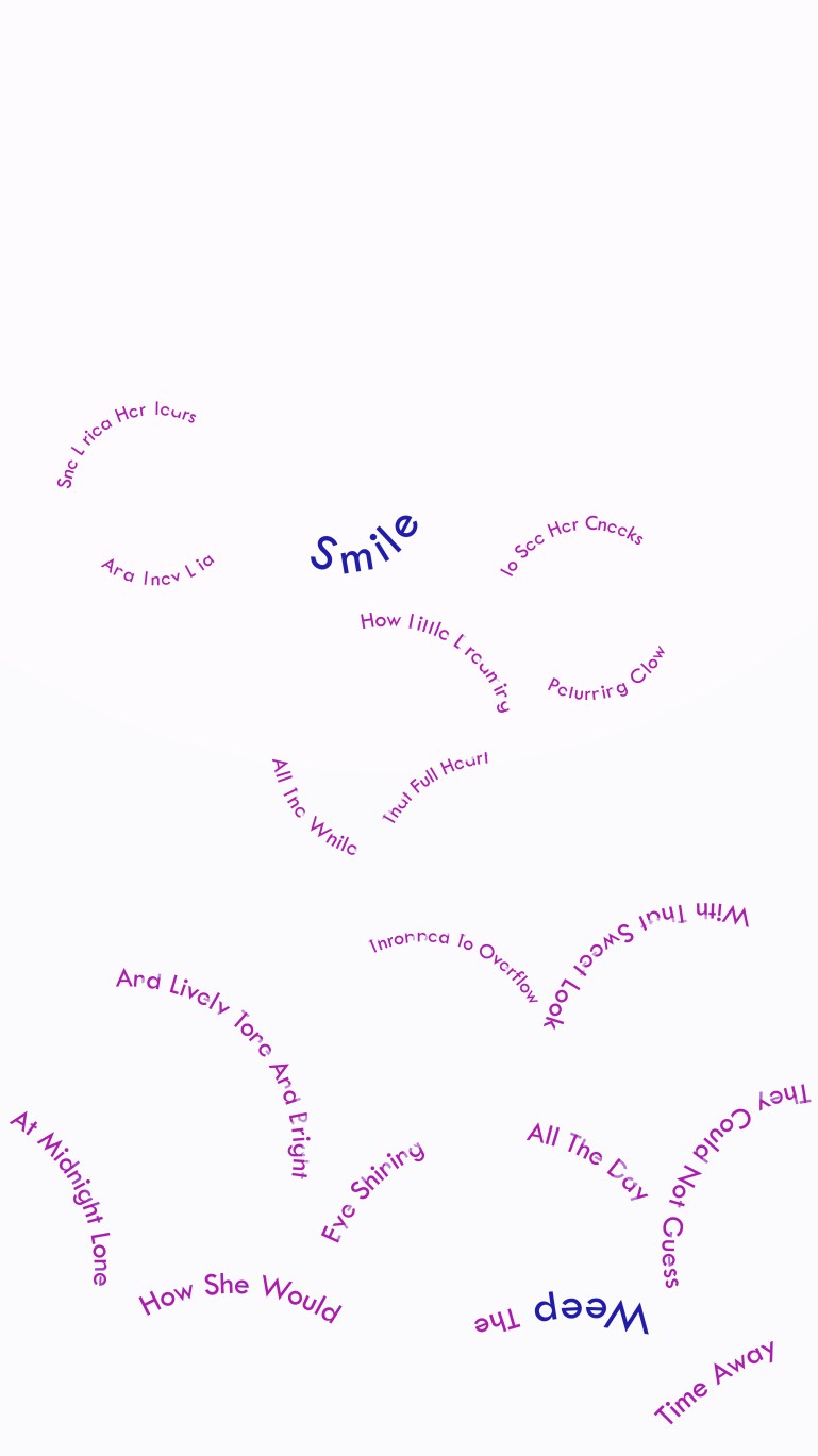
Once I had decided on that idea as a base, I took my idea to Adobe Illustrator. This allowed me to experiment further with the text layout without having to re-do it every time.


I still felt that the design looked to busy having both the circles and the text – so following that Kidd Chip had said, I took out the circles to show “only what’s necessary”. I kept the words ‘Smile’ & ‘Weep’ larger to emphasis the contrast on what the world see’s in comparison to what the girl in the poem felt. When it came to adding colours, I kept these two words separate by having them in blue and the rest of the text in purple.
To allow the viewer to have a chance to understand the poem, I began to fade the missing lines of the letters back in the further down the poem got. As it’s a gradual change, this could also work in favour of the context of the poem, as the further down the poem you get, the more you understand the true meaning of the letters in front of you – this could also be applied to the girls feelings.
Final Outcome
Overall I enjoyed working with type and was pleased a discovering a new way to use the English language. I feel like the dramatic change of the letters wasn’t highlighted very well in this design however, perhaps it would work better in a simpler design.

Great process – the stencil and playing with deconstructing type, language and meaning has much potential for future investigation. I think if you approach typography from an illustrative perspective and playful way then you will have much fun!
LikeLike
check out the work of Patrick Thomas
https://patrickthomas.com/
LikeLike