
Materials
This week I’ve been researching into how using different materials and mediums effect our final outcomes in design. A few weeks ago I stumbled across a TED talk done by Christine Sun Kim. Being born deaf, she explained how she experiences sound in a completely different way to hearing people – tactically, visually or even as an idea. Using her experiences she began creating art demonstrating sound from her perspective, using the tools we use to communicate sound as well as variations of a combination of ASL & sound.
I particularly like her experiments she’s done using sound as a tool – by playing paper and an object or substance on top of a speaker, she was able to capture the movement of sound as it vibrated the paper, making marks across the page. She mentioned that feedback was one of her favourite sounds to make as it create an extremely physical experience, you can feel the vibrations through your entire body.
This led me to wonder about the possibilities and perspectives we could discover through people with other sensory impairments such as visual, touch or even space awareness. This not only could lead us to discovering an entirely new approach to design but it could also help us understand alternative ways to include these people within the design community, bridging any accessibility issues we may currently have. When looking into this I came across The Hands on the Wall project. Based in Chile, there are six murals that offer visually impaired people the chance to experience street art through braille and audio guides.

This is fantastic and I really love this idea. However this got me thinking, braille is an obvious way to include visually impaired people, but this only really implies to visual concepts. Design can be led through a series, a mixture or an isolation of the senses. The first thing I want to do when I see layered painting is touch it, usually I can’t (unless it’s my own!), but I do love to feel the different layers of paint. You can feel the movements and emotion. I particularly enjoy the random bobbles of build up that have been left on the page.
This is close up taken from one of knife paintings done by Joshua Honey This series of multi-layered painting where created in order to spread awareness of men who suffer from mental health. I feel that the use of layering here has been done so well that it really doesn’t need to be visualised in order to have an effect. The layers have physically embodied the message he was trying to get across.

It was interesting to find out more about how sound can effect the way we work as well as be used as a material itself.


I really enjoyed watching this video that Jamie posted onto Padlet, I find that Chipp Kid has such a fantastic way of phrasing design matters, it’s very to the point. This clear, to the point sort of communication reflect in his designs too.


The Idea
This week I was given he task of creating a design based around a specific emotion I believe my environment to be best reflected by. Without a shadow of a doubt, I knew I was going to be using nature as a primary base of my design one way or another.
The timing was extremely convenient, as that week my Grandma had sent me a photograph she had taken of a tree that had been cut down just round the corner from where she lives.
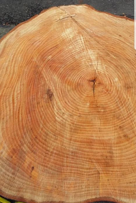
We originally began counting the rings to try and figure out how old it was (I got 49, Grandma got 52) but then she moved on to saying how she couldn’t help but capture it as it had looked so raw. After hearing that I couldn’t help but feel sad. And it got me thinking – we collectively do so much wrong to nature, for the sake of convenience or pleasure, we’ve destroyed habitat’s and undone it’s masterpieces. Yet it still gives us so much back. Was this forgiveness or simply resilience?
![Scan 21 Nov 2018[1808] 1](https://sianlaurasthoughtsandtheories.science.blog/wp-content/uploads/2018/11/scan-21-nov-20181808-1.jpg?w=770)
It didn’t take much research to see that nature does not forgive. Every action we’ve taken against the earth has always had a repercussion, not always instant but it has always hit back hard. Resilience it was.
However, in this weeks lecture Sam Winston proposed that by going into a creative space with a preset idea for a design, you are in fact limiting yourself to the materials that would only be suitable for the subject you’ve chosen. For example, if you went looking for materials to use in the city because you wanted to create a poster, you may only find or see the materials you’re already aware of working on posters. You’ve collapsed your creative space down – which may result in you overlooking amazing new ideas and opportunities.
So, with that in mind, I decided to go for a walk within Bradley’s nature to collect material to use, leaving behind concepts I had already created around the emotion ‘Resilience’. This was a truly liberating feeling. It sounds extremely cheesy (it probably looked it too) but as I was walking around collecting leaves and broken branches, I couldn’t help but smile! I had no sense of panic like I usually do, because ‘this wouldn’t work for this’ or ‘that’s too big/small’. I was just walking around, picking up, admiring and collecting materials just because I liked the look of them.
On my way back home I began thinking about all the things I had seen and collected along the way – everything held such energy, the leaves were so full of life even though at that point they were on the ground, lifeless. they gave energy. So it only made sense that that’s the emotion I was to chose. Energetic.


![Scan 21 Nov 2018[1808] 2](https://i0.wp.com/sianlaurasthoughtsandtheories.science.blog/wp-content/uploads/2018/11/scan-21-nov-20181808-2.jpg?w=423&h=681&ssl=1 "Scan 21 Nov 2018[1808] 2")
Initially I was thinking of using the bark, leaves and sticks collected as new stamp materials. But then I came across a few of Giulia Benardelli‘s designs, she uses coffee spills to create fantastic pieces of art. So I thought of possibly combining these two ideas which would result in me using coffee stamps using materials found outside. This way I could use coffee to act as a visual metaphor for natures energy.


However, when it came to testing this theory out, it didn’t work entirely as planned. The consistency of coffee isn’t thick enough to be able to capture the print of the leaves, it was too loose and unstable. Sure I could of played around the the consistency a little more by changing the coffee to water ratio’s but ultimately I knew that this wasn’t something that was going to portray the patterns of the leaves very well if at all. Saying that – it certainly wasn’t a waste of time, I really enjoyed exploring the possibilities of working with coffee – and I’ve gained coffee scented notepads too! Score!
![Scan 21 Nov 2018[1808] 3](https://i0.wp.com/sianlaurasthoughtsandtheories.science.blog/wp-content/uploads/2018/11/scan-21-nov-20181808-3.jpg?w=414&h=520&ssl=1 "Scan 21 Nov 2018[1808] 3")
![Scan 21 Nov 2018[1808] 4](https://i0.wp.com/sianlaurasthoughtsandtheories.science.blog/wp-content/uploads/2018/11/scan-21-nov-20181808-4.jpg?w=348&h=520&ssl=1 "Scan 21 Nov 2018[1808] 4")
I began attempting to draw out potential layouts I could create using the materials I had. I looked closely at one of the leaves I had collected and found that after closer inspection it didn’t look energetic at all, it look tired. It had wrinkles in places of natural movement, just like we would. The earth is tired.


I then recalled another part of the lecture, where Sam had spoken about how designs can often look like they’re saying one thing but their telling another. So that’s what I’d do. I create a design based around energy, using the tired materials I had collected.
In order to preserve the original textures of the leaves, I wanted to create a structure or a model using them, that way I could create a design that said energy from afar, but then I could get some macro shots to show the materials wear. The only problem I then faced is decided what symbol/object or animal would be best to symbolise energy? After reading through the few snippets of A Smile in The Mind that were provided in my reading resources, I came across one of Sarah Illenberger’s designs – Flowerworks.

I loved this idea of using parts of nature to re-create every day scenes or objects. In this case, fireworks. I began to explore her portfolio and I loved what I found.


What stood out in particular was her Natural Matters series. Here she had made a variety of atomic models made from natural matter found in nature. After looking through this series I felt that light bulb of creativity turn on – I would create an atomic model of whatever compound natures uses to grow to symbolise natures energy.
![Scan 21 Nov 2018[1808] 6](https://i0.wp.com/sianlaurasthoughtsandtheories.science.blog/wp-content/uploads/2018/11/scan-21-nov-20181808-6.jpg?w=261&h=348&ssl=1 "Scan 21 Nov 2018[1808] 6")

By researching into how nature produces it’s energy – I found out about Pyruvic Acid.
“It is the output of the metabolism of glucose known as glycolysis. One molecule of glucose breaks down into two molecules of pyruvate, which are then used to provide further energy”
![Scan 21 Nov 2018[1808] 5](https://i0.wp.com/sianlaurasthoughtsandtheories.science.blog/wp-content/uploads/2018/11/scan-21-nov-20181808-5.jpg?w=357&h=268&ssl=1 "Scan 21 Nov 2018[1808] 5")
![Scan 21 Nov 2018[1808]](https://i0.wp.com/sianlaurasthoughtsandtheories.science.blog/wp-content/uploads/2018/11/scan-21-nov-20181808.jpg?w=357&h=268&ssl=1 "Scan 21 Nov 2018[1808]")

I drew it’s atomic model in both 3D & 2D to see if there where any more elements I could explore, but seeing as I already had the idea of creating a model out of the leaves and material I had gathered, it only seemed natural to go with the 3D design. It also ironically looked like my balloon-dog ornament, which is always a good sign.
Construction


To begin with I wanted to create a mini model using these tree seeds I had collected so I could see if simply using hot glue was going to be enough to hold the structure together. I found as the seeds already had open layers it was quite easy to secure the twigs, certainly had to practice steady hands but overall I found it worked pretty well. Although this model was originally intended to only be used for practice, I actually found that I like the final outcome quite a a lot. So much so that I was actually tempted to stop here, but I couldn’t bring myself to leave out the leaves entirely, so proceed to make a larger model using the leaves and remainders of the branches.


")

As I had collected the leaves a few days previously, they had become dried out and a little more difficult to mould without damaging them. So I used rolled up paper as a base to wrap the leaves around to ensure they would remain sturdy enough when it came to attached them all together. Once I had created all the leaf balls and broke the branches down to their required sizes, I laid all my material out to see how they would look once attached – this allowed me to see that the branches I had originally broke up were slightly too long. After break them down once again, I started with the glue! Putting this one together was a trickier than my previous model as there was no natural groves to insert the branches into the leaves and if I were to only glue the branches to the surface layer of the leaves, it was likely that the first layer would simply break off if any sort of pressure was applied. So to ensure that the branches could attach fully to the leaves I created small holes in the leaf balls using a pen before gluing the branches into place.


The Outcome


I decided to use both my models as I felt that they each brought different elements and textures – by using them both together I was bringing in scale as a contributing factor too which I really liked. I originally thought of keep their backgrounds white to bring more focus on the models themselves, but found that by adding a blue background it actually enhanced the models more as it created a lively contrast.


Looking back on this project I’m so happy I decided to experiment with ways on which I could display my final project, I felt that the models just wouldn’t of looked as impressive if I was to take photographs of them level on a surface. I really liked the floating appearances that was created by choosing to hang them on fine thread. The only thing I would of changed looking back is to of gotten closer with the macro shots, and perhaps of tried using a variety of different colours in the background.
