Research


Brian Eno – Creative Potential
Within this weeks resources, we had a few different video’s about Brian Eno – the one that stood out the most to me was his ‘Creative Potential’ video. He speaks about how we single out certain individuals and call them ‘genius’s’, so we notice and pay attention to the actions of that one individual, but what we don’t pay attention to is their surroundings. Most of the time they’ve lived within and taken inspiration from their surroundings. Brian proposes that these creative spaces are to be recognised as ‘scenius’s’ as they’ve played a crucial part and provide intelligence towards an outcome. He also speaks about how most people don’t have the opportunities to tap into their on genius as they’re very limited by the 9-5 jobs. Everyone has a particular set of unique gifts, but because people have to earn a living we don’t usually discover what our talents are or have the chance to explore them.
Found an interesting article where Brian approaches the same topic again, however this time he talks more about learning to become calm to allow for creativity to happen.
https://99u.adobe.com/articles/7034/developing-your-creative-practice-tips-from-brian-eno
…a practice of some kind … It quite frequently happens that you’re just treading water for quite a long time. Nothing really dramatic seems to be happening. … And then suddenly everything seems to lock together in a different way. It’s like a crystallization point where you can’t detect any single element having changed. There’s a proverb that says that the fruit takes a long time to ripen, but it falls suddenly … And that seems to be the process.
Skill Gaps
Skills I Have:
· Curiosity
· Drive
· Perspective
· Empathy
· Illustration (Pen, pencil, paint)
· Watercolour
· Craft
· Company Marketing (logos, posters, e-shots, social media ect)
· Virtual Illustration
· Adobe Creative Cloud (Illustrator, Photoshop, Premier, InDesign)
· Video Editing
· Web Design
· ‘Child-like’ imagination
· Detailing
Skills I’d Like to Develop:
Ways of thinking;
· Making use of references & inspirations
· Slowing down idea processing
· Reflection
· Questioning
Areas of knowledge;
· Graphic design history
· Typography
· Layout Impacts
· Similar designers
· Design for good
· Social impact
· Scientific design
Ways of working;
· Photography
· Videography
· Craft (stamp making, letter press, modelling)
· Animation
· Use of real-life material (natures, litter, household objects)
· Collaboration
‘Re’ Words


This week I created to mind maps to demonstrate skills I currently posses and skills I wish to develop or ‘fine tune’. After creating both these mind maps two things became clear.
- The mind map that reflect on the skills I’m aware of having is pretty sparse in comparison to the one reflecting skills I’d like to develop. This either show cases my on-going curiosity for all things new – or that I simply don’t think too much of myself.
- Most,if not all, of these skills have been or are to be actioned by a ‘Re’ word. Redoing, recycling, redesigning, respecting.
To begin with I focused solely on repetition. This was a word that I was comfortable with using, possibly because it’s something I had already experienced first hand – being self taught, I would use repetition to study and learn a new methods of design.
However, by using just repetition alone to overcome a task it can become quite easy to fall into a spiral – this is when I would begin to experience what I call ‘mind stutters’. When your mind is so full of frustration and anxiety that it just can’t seem to get any ideas or actions out. You become so focused on the task at hand that you become tunnel visioned and lose sight of rational or reason. Usually when this happens, the best solution is to take a break from the project and return to it after some time. Whether that be a matter of minutes or a number of days. It’s almost guaranteed that upon return you’ll see the resolution to the issue right away. All it takes is some perspective.
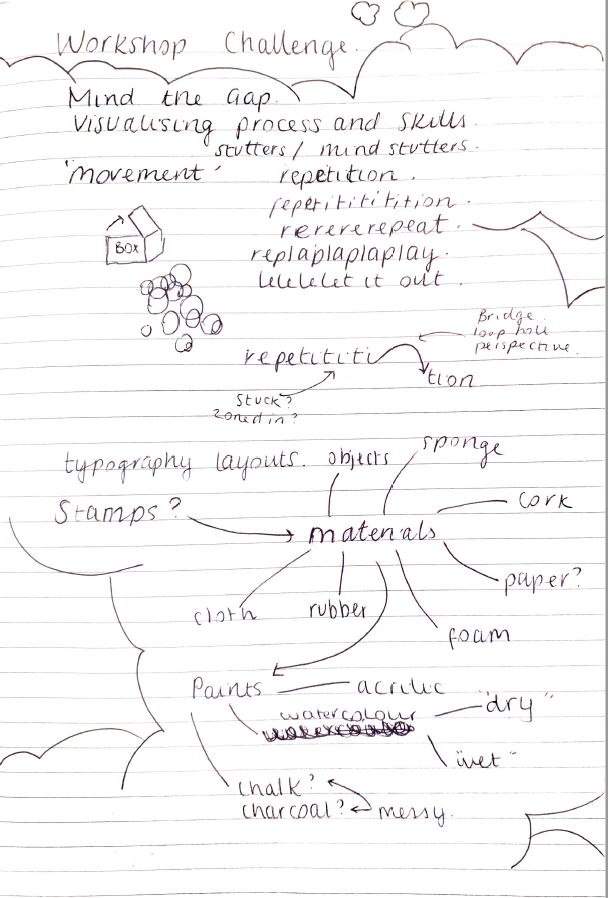
I played around with some potential word play designs, I really liked the idea of demonstrating a ‘mind stutter’ in the form of a speech stutter, by repeating letters of words. I then had the idea of using stamps to create the effect of repetition. This way repetition is implied in the method as well as the design itself. I began mapping out potential materials I could use to create a stamp.
I decided to go with foam as I felt that the texture it provided would allow for more experimental stamping, should I want to experiment with multiple colours later on (spoiler alert, I did!).
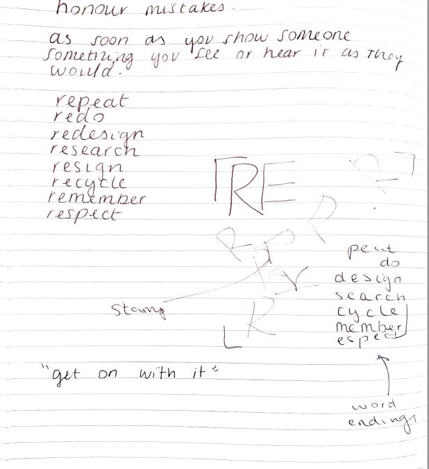
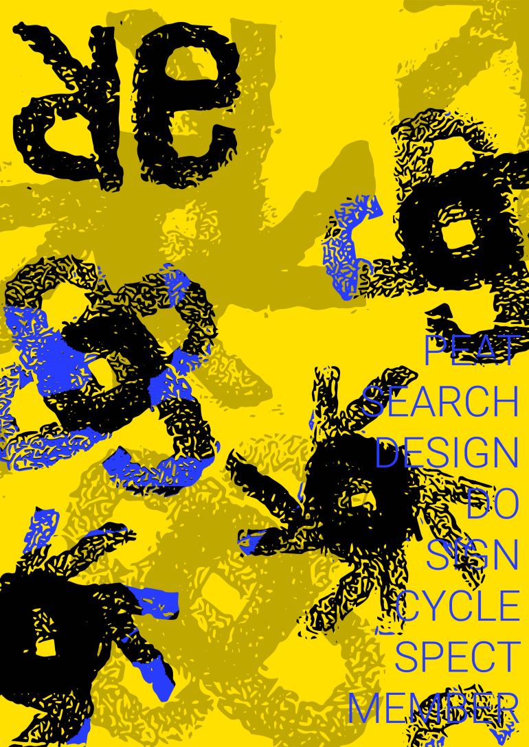
So I had decided a method. Now for the content. I knew this week I wanted to use typography to challenge myself, almost dare myself. So after revisiting my mind maps, I just wrote down the ‘re’ words that came to me. Seeing as they all all shared the same two letters, it just felt natural to separate the words this way and use the ‘Re’ as a header to the rest of the words.
Creation


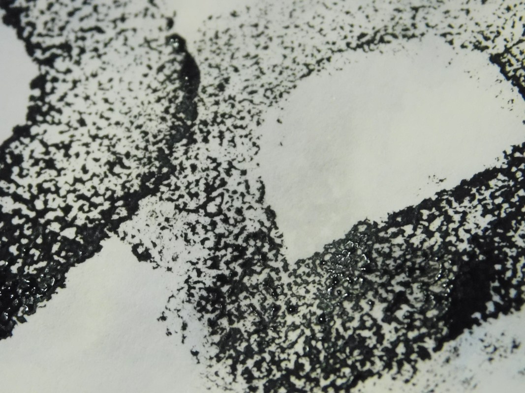
After foraging a foam cushion and some acrylic paint from town – I returned home and made my first attempt at creating a stamp. As the R and the E were going to be the main features, I started with these first. I cut out a small square of the foam from the cushion and drew a rough R on the top then cut into it using nail scissors. Then without much thought, I poured out some of the blue acrylic and began stamping onto my notepad.


This led me to see the first teething problems – I had left too much foam around the edges and they were beginning to show when I pressed the print down. I cut the foam a lot further down to avoid this happening again and continued mindlessly stamping. I also noticed that by drawing the original R this was then mirrored when I stamped it onto the paper. But as I was going to be playing with it’s shape anyway, I decided to keep it this way. As Brian Eno said – “Honour thy error as a hidden intention“.
Lucas Czarnecki created a video I had found on his website, Type365 talking about the relationship between type and colour. He stated that it is important to add colour last as this allows you to focus solely on the design itself without having the crutch of colour to make it look better. As someone that instinctively chooses colour – I wanted to challenge myself to creating a design purely in black and white before adding any colour, if I was to add colour at all.
I recreated another R stamp with better proportions than the first and began experimenting with the shapes I could create using the R stamp alone.


Then onto the ‘E’. In my first attempt I created the E as a capital, but I just didn’t feel that it didn’t suit the R and the patterns it was created appeared too formatted and rigid.


So instead I decided to make the ‘e‘ lower case, which in hindsight makes the most sense anyway seeing as it is meant to continue R in a word. I immediately felt like this was the right choice, by putting the e into lower case I was able to create similar patterns and shapes to what I did with the R stamp.


The round body of the e gave it such a warm, approachable feel. In fact, I found that the pattern created by having the two ‘e’s lean against each other gave the appearance of the intimacy. It’s strange how much life you can throw into a shape or pattern through a shift of perspective.
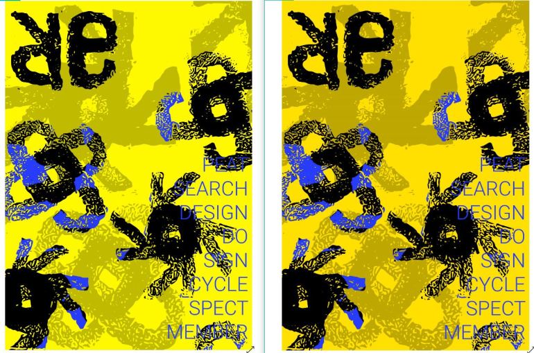
After gathering an idea on what patterns I would like to create using the stamps, I then began to play with colour, I knew I wanted colour to remain an add on rather than a main factor within the contents – so I choose to keep the stamps primarily black then add a dab of colour on top to see how the colour sat amongst the black.


Adding my favourite two patterns created with both the ‘e’ and the ‘R’, I came up with a draft of what I wanted to use within my final design.
Digitisation


I scanned my original designs and took the to Illustrator to finalise. Doing this allowed me to experiment with my existing designs faster – it also provided restrictions as I had limited my materials down to whatever patterns I had chosen to scan, allowing me to concentrate on the composition of the design rather than continuing to come up with new concepts.


Final Design
After some reflection on this project, I wish I had trusted in the initial crafting of this piece. I feel like the beauty of the stamps was lost by digitising the entire design. The creation seemed to of held a lot more depth in comparison – I’m sure there’s a way to bring this design into a digital format without losing this, I’m just to figure out how. This is a design I’ll be looking back on to re-do at a later stage.
However I did really enjoy working with stamps. I like how by working with a pre-set design, you can allow yourself to really explore any sub-conscious ideas you may have whilst playing around the stamps without losing your original context. I’m really interesting in how you can use stamp textures to your advantage and I’m excited to work with these again in the future.
