
The Concept
I’ve always found it easier to draw something up to communicate a message rather than having to verbalise it. They say a picture is worth a thousand words and for good reason. An image allows the viewer to receive information in their own unique way, each person will be drawn to different elements and have their own take on it, emotionally and/or perceptually. Meaning that each time it is seen, it adds yet another, personalised message to the image.
My first instinct was to create one face across all four elements of my Quadriptych. I thought I could find a way to showcase each element of my story though different facial expressions. As people see faces everyday, it’s second nature for us to take in what an expression says. So I thought this may be a good way to connect with the viewer and show my story and emotions.
However, once I began giving myself labels in order to try figure out what I wanted my first face to be for the ‘Who’ element, I found that each description was making me think of an object, rather than a face. So I chose to go down a more metaphorical approach using images of objects to tell my story.


Creation Process
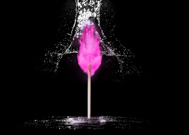
Impulsive. Creative. Energetic. Conflicted.
These are the words that first came to mind when I thought of how I would describe myself for the ‘Who’ element of my quadriptych. These words very quickly took the appearance of objects in my mind, so I created this image to reflect this.
A match for impulse.Water to conflict the match. Powder paint in replacement of fire for the creation. A heavy black background to give a high energy contrast.
As I didn’t have any images of my own to use, I chose to use stock images from Pexels.com to create my work. This allowed me to explore how I can use Photoshop for photo manipulation, something that is still very new and exciting to me. The two main tools used in this process with the clone stamp, and the masking tools. I learnt how to effectively use brushes to gain the effects needs to merge the images together.


The biggest challenge I found when creating this piece was making the powder paint look like it was coming from the match. Once I had created the ‘flame’ using the powder paint, I saw that it looked completely disconnected from the match. To overcome this, I spent some time researching other images of lit matches and amended my design accordingly using masks from the burning match image and emerging them into the paint to create a more synchronised look.


Overall I’m pretty happy with how this image came out. I especially enjoyed creating the fire using images of powder paint and I like how you have to look closely at the image before actually realising that the ‘pink fire’ isn’t actually what it first perceives to be.
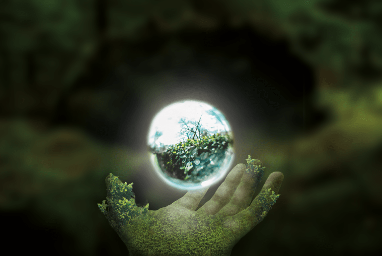
Clarity. Support. Nature.
I knew from the get go that I wanted to include how much of an influence my environment has been to my mental being. It has directly influenced both my personal and my working life.
I live in Bradley, North Yorkshire. A small village that is bursting at the seams with it’s vibrant nature. I find the openness of where I live to be extremely calming, it’s always been able to bring me a sense of true clarity both mentally and physically in times of panic and anxiety. Nature has a such a strong will to just keep going, adapting to what ever what we throw at it. That relentless force fascinates me and gives me the inspiration I need when I’m feeling stuck with a project.
I wanted this image to signify the support my environment provides me. I am being represented by the orb in this image, that is glowing and whole from the support of natures hand. Here are the images used to create this final image.


Creating the hand to look like it was ‘from nature’ was extremely challenging, the final look does get my idea across however I feel that if I spent more time into blending the moss/leaves together it could of produced a more believable look.
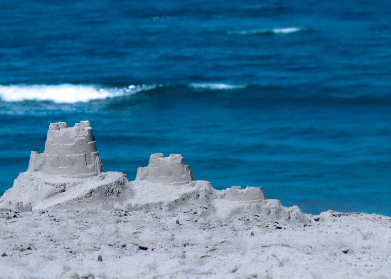
Persistence.
I firmly believe that one of my key strengths is persistence. In real life circumstance as well as design my ability to take on new tasks with uncompromising energy and perseverance has led me to where I am today.
I have chosen to show this through a series of sandcastles, showcasing the different stages of progression. Trial and error played a huge part in my learning along the years. I chose to keep the sea in the background to show that you don’t need to take away your obstacles to overcome them. In this instance, you have to simply move away from the sea.


Looking back on this piece, there are a couple of thing I wish I did differently. I feel that the stages of development aren’t particularly clear because there isn’t enough space in between each stage to separate them. Also, the final stage, being the finished sand castle, could of done with having something else to make it stand out as the final stage such as a flag, or by simply making it bigger.
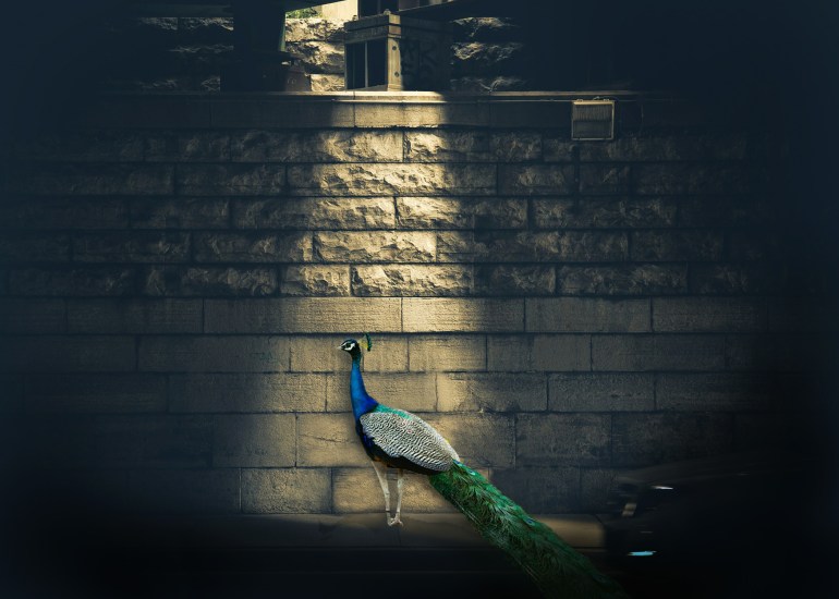
Production. Projection.
As a working graphic designer, a recurring issue that I have experienced is explaining my ideas to others. Followed up by the second hardest task – getting them on board with it.
I have found that by using visual aids over verbal, I am able to project my ideas as well as express my emotions to others clearly and effectively. The peacock is a symbol of my creativity, thoughts and aspirations in graphic design. The light flooding down onto the peacock is to exemplify how using graphic design allows me to display my theories with others. On the other hand, it also can be perceived as ‘that moment’ of inspiration, when a new idea suddenly hits and displays itself in an obvious, stand alone manner.


I feel that this may the weakest image of the four simply because looking back at it, the peacock doesn’t look fully emerged into the photo. But I’m happy with how the image works to display what I had in mind.
Final Outcome

I’ve taken a lot away from this weeks project. It was really frustrating having to rely on stock images to create what I had in mind and I felt it really limited the outcomes I was able to produce. Since this, I’ve come into possession of a camera so I can go out and collect materials myself. I believe this one tool alone would of completely changed the output for this design.
It has also led to me using pen to paper methods of thinking before going straight into a digital way of working. By drawing out and mapping lots of potential ideas it allows me to adapt or expand on initial ideas – whereas if I jump onto a software and begin creating straight away it leads me down a very restrictive path as everything looks immediately ‘finalised’.
That being said, I’m still happy from what I managed to produce, in particular I quite liked the first image, the “Who”. I like the idea behind it and believe it had lead to a interesting visual, whether you’re aware of the context behind it or not.
Notes & Takeaways
This first week has been a fast, head on experience which has been just as exciting as it has been daunting. The case studies provided in the hub on established graphic design practitioners gave me a sense of relief when I realised that everyone, including educated and experienced graphic designers, are still learning each day. It was fantastic to hear how each person takes to working differently, in particular I really enjoyed hearing how Simon Manchipp’s practice adapted to change by integrating their entire office so that all departments work amongst each other.
Watching the short documentary on Paula Scher has made me keen to want to experiment further with typography. She manages to ‘made type talk’ in ways I couldn’t imagine and enjoyed hearing how she had to adapt each of the album covers she did for artists. The highlight of the documentary to me was seeing her diagram of a meeting. It’s fascinating to see that clients show the same behaviours throughout the industry, whether their design is completed by a well established graphic designer or a less experienced free-lancer, it seems that people are almost designed to pick out flaws when being introduced to a new design and/or idea. It really spoke to me when she spoke about having to have to be in a ‘state of play’ to design – Christoph Neimann also mentions something along the same lines during his episode;
“It’s not about waiting for hours until this moment of inspiration strikes, it’s about showing up and getting started and then something amazing happens or it doesn’t happen. All that matters is that you enable the chance for something to happen”
This gave me such a feeling of ease as getting in the right mindset can be one of my biggest challenges when it comes to graphic design. Due to this I feel that carrying a notepad around with me as I continue this course is going to be a real beneficial element to my development.

Good Reflection Sian. Really good to see you thinking about your own context in relation to the material we have created for you. Yes we are all learning every day and a skill that a good designer should have is the ability to evolve and learn new skills. To be able to adapt.
LikeLike
Your approach to creating montaged images to tell a story is ripe for further investigation. I posted a link to a 3D image maker who uses 3D digital programmes to create photo realistic pieces of work which is different but really interesting. I would love you to investigate different methods of creating your own content. Carry a camera with you, collect materials and scan them in- start creating your own personal archive of imagery to play with in relation to some of your workshop challenges. You will often hit upon ideas or ways of working that you can utilise again or develop down the line in another context. I also am pleased to see you are interested in investigating how to play with typography in creative ways. I think you need to play with different tools and see what happens. Love your spirit and open attitiude to learning. You also reference your relationship to space and nature and wellbeing – this is also an area that can really be investigated as a personal research angle. Log the ideas, collect and create an archive of work that influences you, your own personal visual database of materials, photos audio recordings etc etc. Your research can extend out of design – take for example the design and wellbeing angle or design and nature – you could look at social sciences, geography, science as an area to research into. Have you heard of the Wellcome Trust https://wellcome.ac.uk/
Check them out they do fantastic exhibitions.
LikeLike
also check out the work of Morag Myerscroft – She has produced work for hospitals, public spaces – she is obsessed with ‘belonging’ her design makes people feel human emotion such as joy and hope- it is experiential She was one of the speakers at the london design festival this year https://www.designboom.com/tag/morag-myerscough/
LikeLike